


Recession Model Update (November 2019)

Friends,
Recession probabilities edged downwards last month, likely driven by:
Positive domestic labor releases (nonfarm payrolls, jobless claims)
Hopes for a "Phase One deal" in the US-China Trade War
Some bright spots in Europe (rising German factory orders) - however tomorrow's (Nov. 14) German GDP data could show the country in recession (defined as 2 consecutive quarters of GDP decline) for the first time since 2013
With a lukewarm backdrop, US stock indices continue to hit all-time highs in the face of still-elevated model recession probabilities. So what gives?
Current Predictions (as of November 7, 2019)
Within 6 months: 28.8%
Within 12 months: 45.9%
Within 24 months: 63.3%

In the next few updates, I will unpack each of the 6 input variables (employment, monetary policy, inflation, yields, curve slope, and stocks) to better understand their behavior in previous market cycles.
Since markets rallied hard on positive October employment figures (released on November 1), this seems like a logical place to start. Additionally, we will take a look at the 3-way relationship between employment, inflation, and recession.
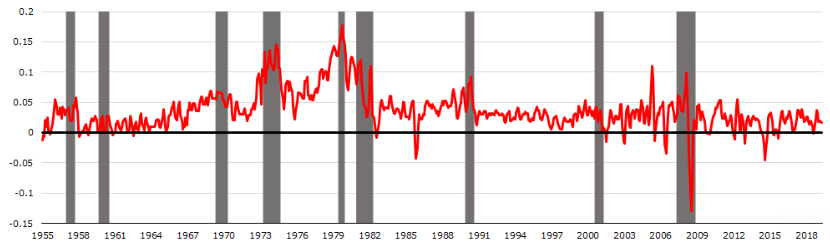
Historical Nonfarm Payrolls
The y-axis is the 3-month (annualized) change in total nonfarm payrolls minus the 12-month change in total nonfarm payrolls. Pretty much what you'd expect: the variable tends to turn sharply negative (indicating hiring slowdown) prior to recessions, but has some false positives and false negatives.

Historical Inflation
The y-axis is the 3-month (annualized) change in the Consumer Price Index. At first glance, it seems to have a worse batting average than nonfarm payrolls, but maybe inflation becomes more important when combined with employment?
Historical Nonfarm Payrolls, Inflation, and Recession
Apologies beforehand for the abysmal formatting in this next chart (I was too lazy to make it prettier directly in Python):
Forecast horizon is 6-months
Orange dots indicate positive classes (recession within 6-months), blue dots indicate negative classes (no recession within 6-months)
Y-axis is same variable as the "Historical Nonfarm Payrolls" chart above, and X-axis is the same variable as the "Historical Inflation" chart above
The location of the most recent observation (November 2019) is circled in red.
The big takeaway from this chart: historically, a combination of high inflation and hiring slowdowns (bottom right quadrant)tends to be associated with near term recession risk. Intuitively, a vicious cycle emerges: less employment --> less aggregate disposable income --> combined with rising costs of living --> less aggregate consumption --> less corporate profits --> even less employment, etc.
Note that a different vicious cycle could be constructed to explain the handful of data points in the bottom left quadrant.
As the red circle indicates, the current situation is borderline: if hiring begins to decelerate meaningfully, it would boost near-term recession risk.

Until Next Time
Terrence | terrencez.com
View previous updates in the archive.
I’m always eager to hear your comments or questions. Just hit reply to this email, and I will respond. You can also fill out the contact form here. Either way, I will respond from my personal email.
All opinions are my own and not the views of my employer.