
Recession Model Update (December 2019)

Friends,
Recession probabilities edged downwards again. Some themes:
A "blowout" non-farm payrolls report last week, coupled with upward revisions to prior months' non-farm payrolls figures.
The Atlanta Fed's "GDP Now" model is projecting 2.0% growth for 4Q19. In mid-November, the same model predicted just 0.3% growth.
Bears continue to focus on trade concerns (next round of China tariffs scheduled for December 15th), market plumbing (Fed repo operations continue to be oversubscribed), and weaker sentiment (consumer surveys vs. executive surveys). Nevertheless, the stock market continues marching upward, while treasury rates hold steady.
Personally, I find it amusing how news sources (TV, internet) are suddenly mentioning "recessions" or "recession warnings" a lot less frequently. Perhaps they recognize that such sensationalist headlines are unlikely to resonate in an environment of all-time highs.
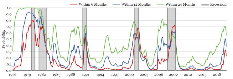
Current Predictions (as of December 7, 2019)
Within 6 months: 22.8%
Within 12 months: 38.0%
Within 24 months: 55.6%
As promised in the last update, we continue to unpack each of the 6 input variables. Today, let's take a closer look at the yield curve and 10-year Treasury Rates.
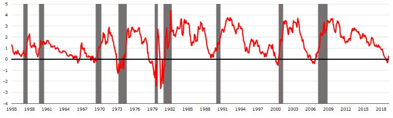
Historical Yield Curve Slope
The y-axis is the spread between the 10-year treasury rate and the 3-month treasury rate. A common misconception is that yield curve inversion coincides with recessions, even though historically the yield curve can un-invert some time before a recession actually begins.
Perhaps not all yield curve inversions are created equal. Some inversions may be driven mainly by the long end of the curve falling, as opposed to being driven by rapidly rising short-term rates. Let's explore this next.
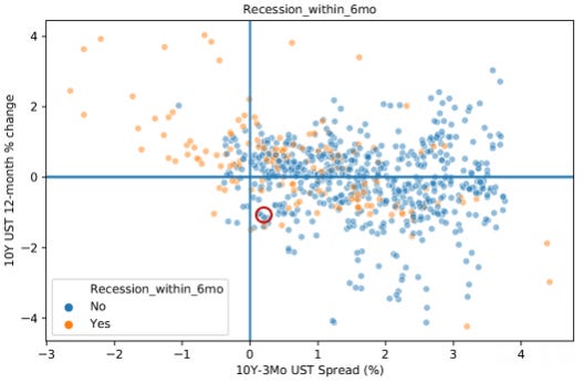
Historical Yield Curve, 10-Year Treasury Rate movements, and Recession
Y-axis is the 12-month change in the 10-Year Treasury Rate, and the X-axis is the same variable as the chart above
The location of the most recent observation (December 2019) is circled in red
My takeaway from this chart is that the top-left quadrant is the most dangerous situation (the curve un-inverting itself as the 10-year rate rises). With this in mind, the present situation doesn't look too precarious. An interesting possibility going forward is that we could move into the bottom-left quadrant, since the Fed is unlikely to hike up the short-end of the curve. The 10-year rate could dive and cause the curve to re-invert. In that case, we would largely be in uncharted waters.
If you have a different opinion on this chart, please let me know.
Until Next Time
Terrence | terrencez.com
View previous updates in the archive.
I’m always eager to hear your comments or questions. Just hit reply to this email, and I will respond. You can also fill out the contact form here. Either way, I will respond from my personal email.
All opinions are my own and not the views of my employer.