


Recession Model Update (August 2020)

Friends,
Current Values (as of August 7, 2020)

As mentioned in last month’s update, it will be interesting to see if this model can signal the beginning of the recovery via falling recession probabilities.
Tracking the Economic Recovery: A Visualization

While waiting for the recession model values to turn downwards, I’ve built a Tableau Public visualization to track high frequency data that can begin to rebound ahead of traditional economic indicators.
The visualization, hosted here, tracks metrics such as:
Mobility: are people staying home or moving around?
Restaurants: are people eating out?
TSA Checkpoint data: are people flying?
Box Office Receipts: are people going to movie theaters?
Unemployment: initial and continuing jobless claims
All data is updated periodically using a Python script.
Using this visualization, I noticed the following…
Visualizing the “Second Wave” of Stay-At-Home
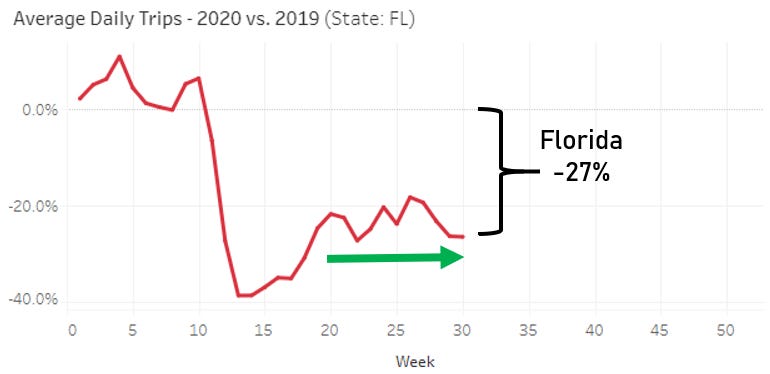
Several states are seeing falling mobility levels, as measured by Average Daily Trips.
This decrease is evident both in states that lifted lockdowns earlier (Texas, Georgia) and in states that maintained lockdowns (New York, California).


One notable exception is the Sunshine State:
You can customize the charts to your chosen location.
Until Next Time
Terrence | terrencez.com
View previous updates in the archive.
I’m always eager to hear your comments or questions. Just hit reply to this email, and I will respond. You can also fill out the contact form here. Either way, I will respond from my personal email.
All opinions are my own and not the views of my employer.